Four years designing the way players get into a world
The sign-up that let them in, the site that told them why, the installer they waited in front of, and the conversation UI they would spend a thousand hours inside. One world, four front doors — this is the working document.
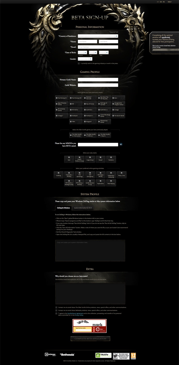
- 1Mbeta sign-ups through the registration flow
- 350Kmonthly unique visitors to the site, before launch
- 5M+player accounts by the end of 2015
 THE ELDER SCROLLS ONLINE · TAMRIEL UNLIMITED
The first screen anybody saw
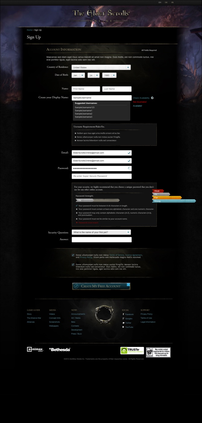
Before anyone sees Tamriel they see a form. Beta registration, and later account creation at launch, was the narrowest point in the entire funnel — the one place a fantasy world has to behave like ordinary software.
The public face of a world
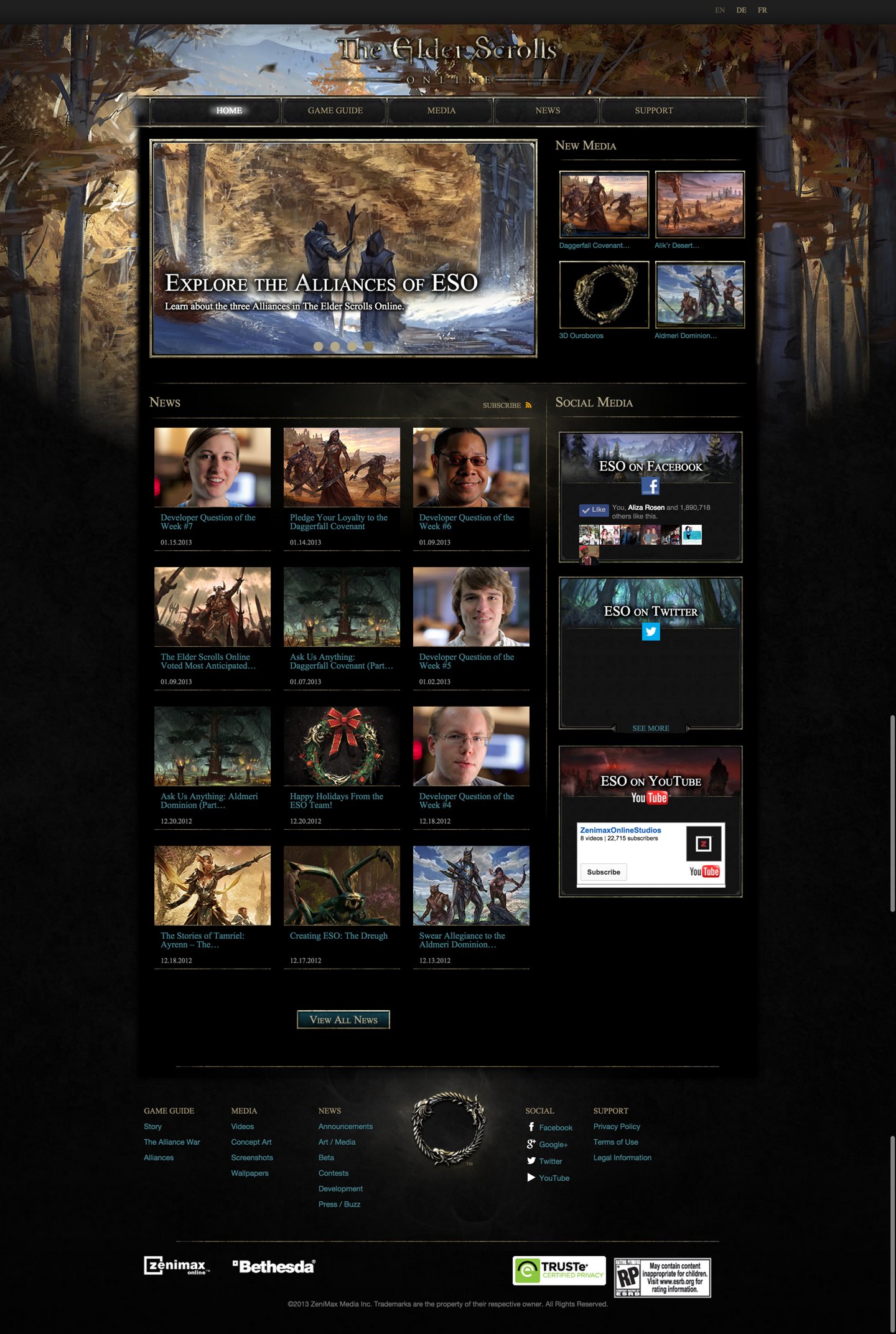
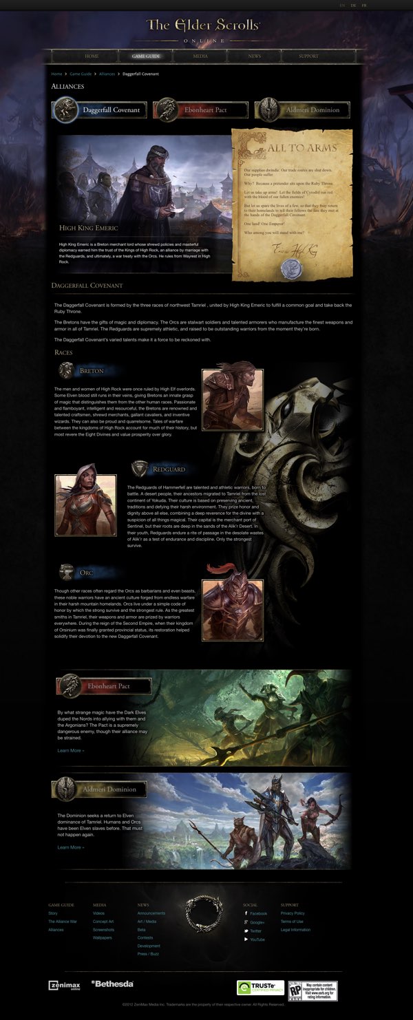
elderscrollsonline.com had to do two jobs at once: sell an MMO to people who had never played one, and serve lore to people who had read every book in the series since 1994.
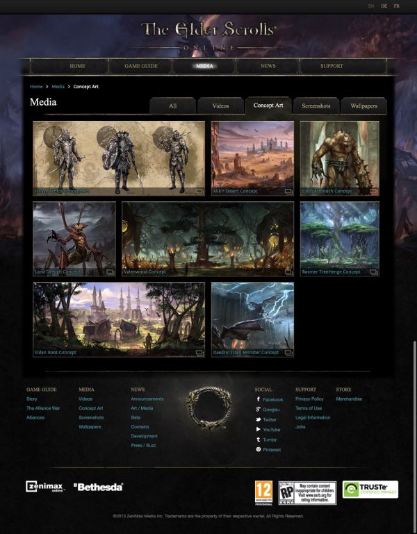
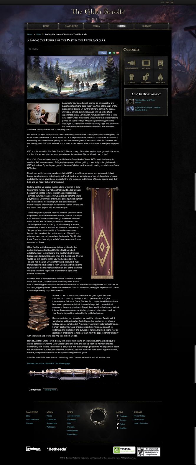
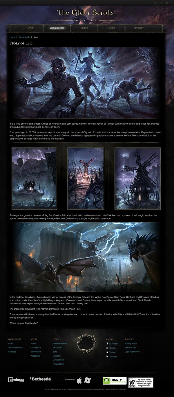
The hour before the game
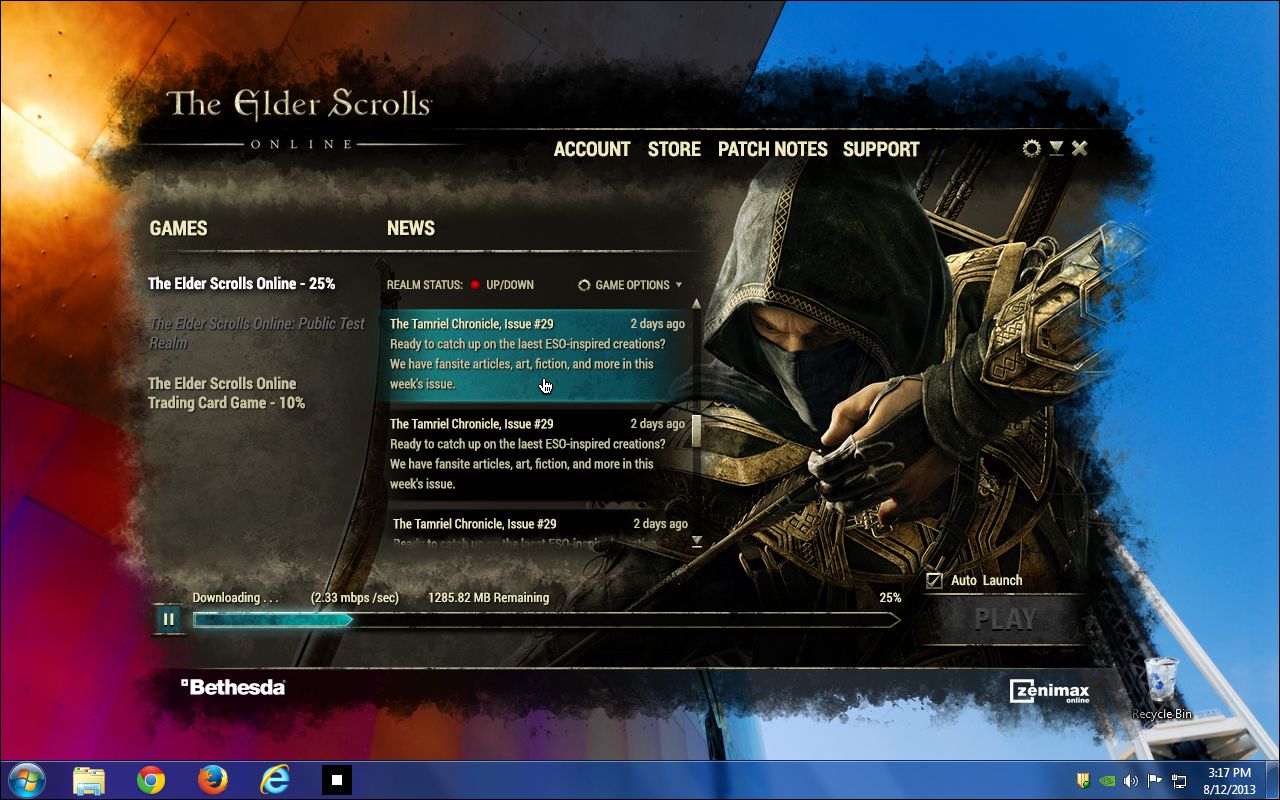
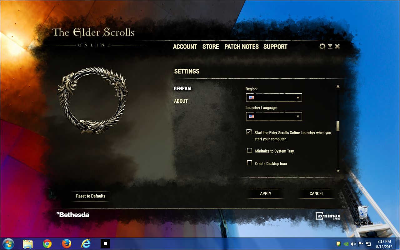
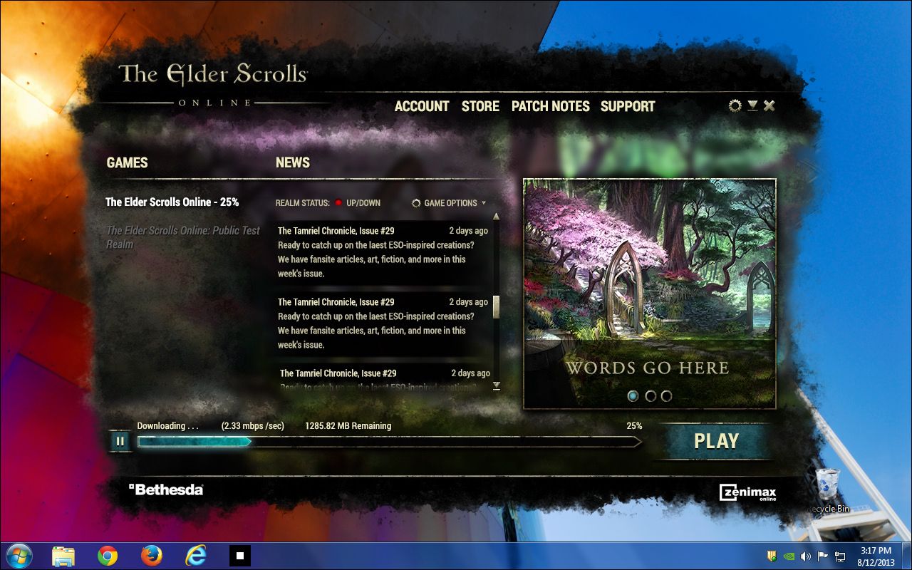
Install, patch, launch. The slowest screens in the product, and the only ones a player meets twice — once on the way in, and again every time they come back.
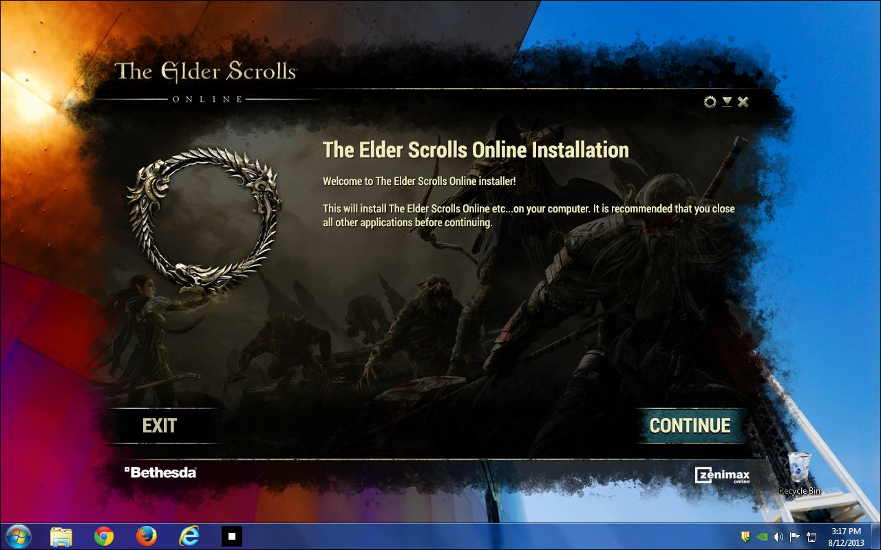
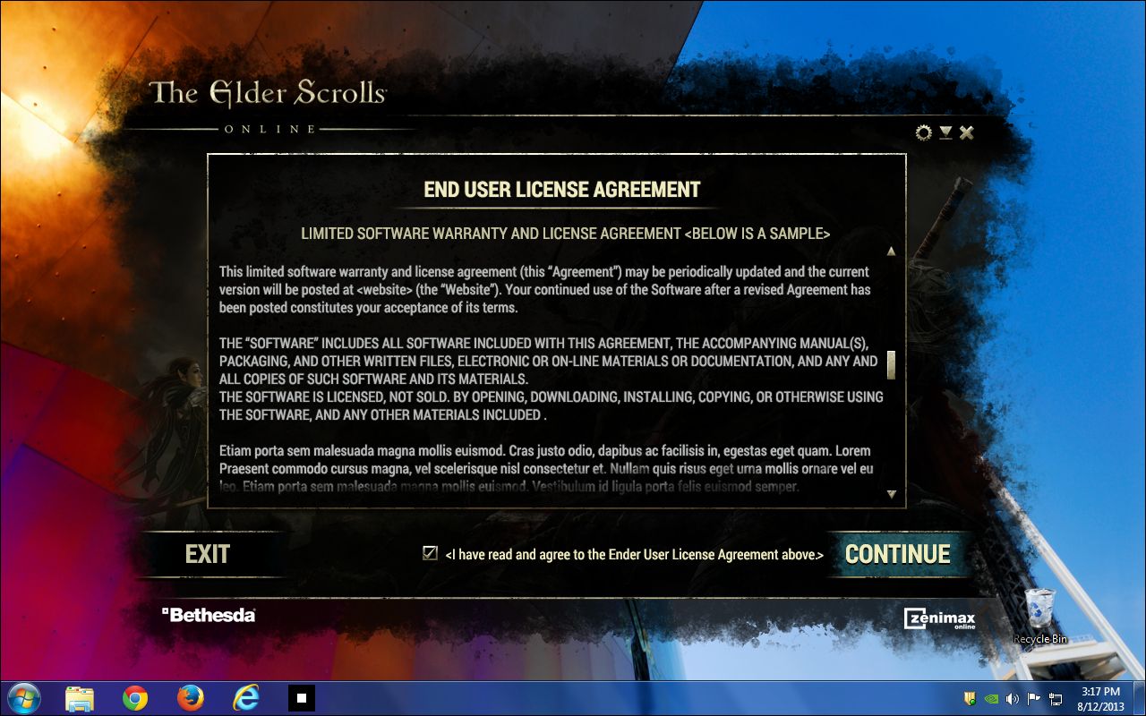
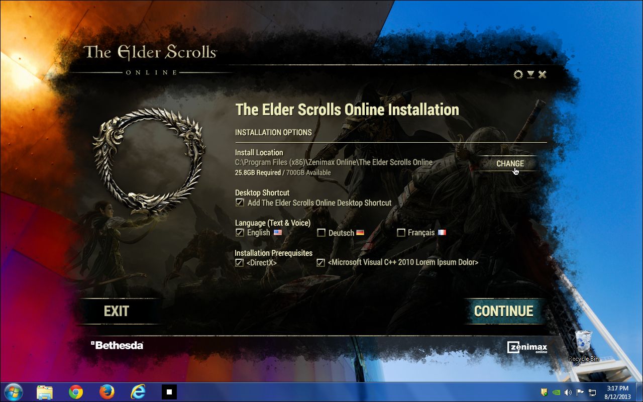
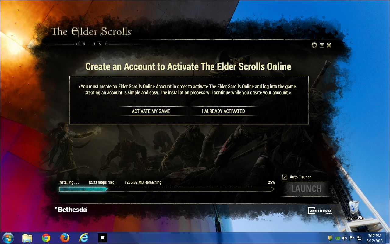
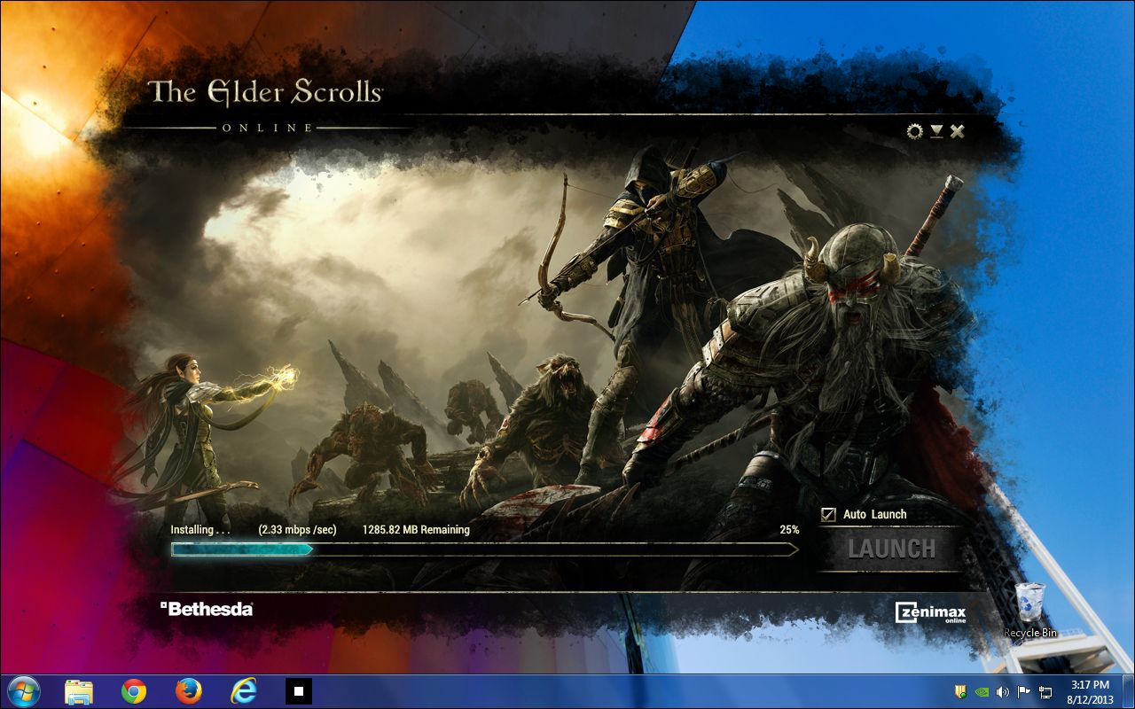
-
A
Kept the world on screen while nothing was happening The copy runs under the same art the site sells with. A progress bar on a grey dialog is a download; a progress bar on Tamriel is the game, starting.
-
B
Asked for the account during the wait, not after it Activation is put in front of the player while the bits are still copying, so nobody is sent back out to a browser at the moment the LAUNCH button finally lights.
-
C
Let the window keep a job after the install The same frame becomes the patcher, the news stand and the settings panel — realm status, what changed, and the one place to set region and language before you are in the world.
How a world talks back
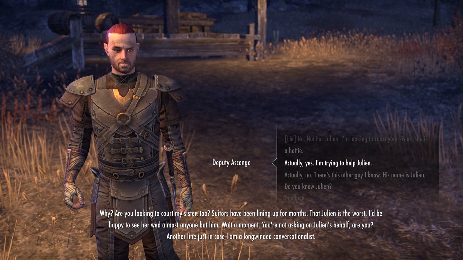
Bringing ESO to Xbox One and PS4 meant rebuilding conversation for a controller and a couch. A mouse can hover to reveal why an option is closed to you. A gamepad ten feet from the screen cannot.
The state had to live in the type itself — not in a tooltip, not in a hover, not in a colour a colour-blind player can’t see.
-
A
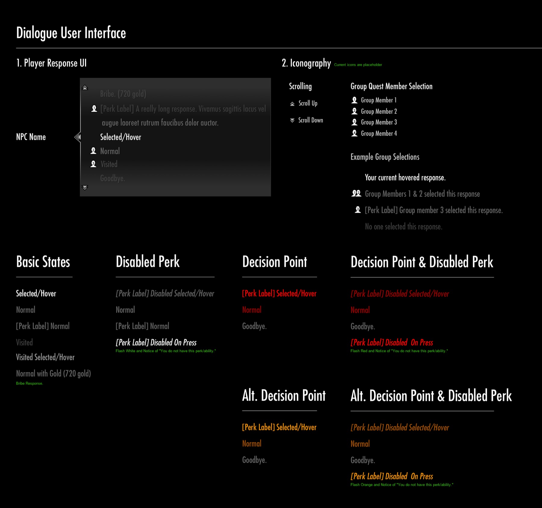
Gave every response a state of its own Normal, visited, selected, disabled-by-perk, decision point — and the combinations. Eleven states, each legible at ten feet without a cursor.
-
B
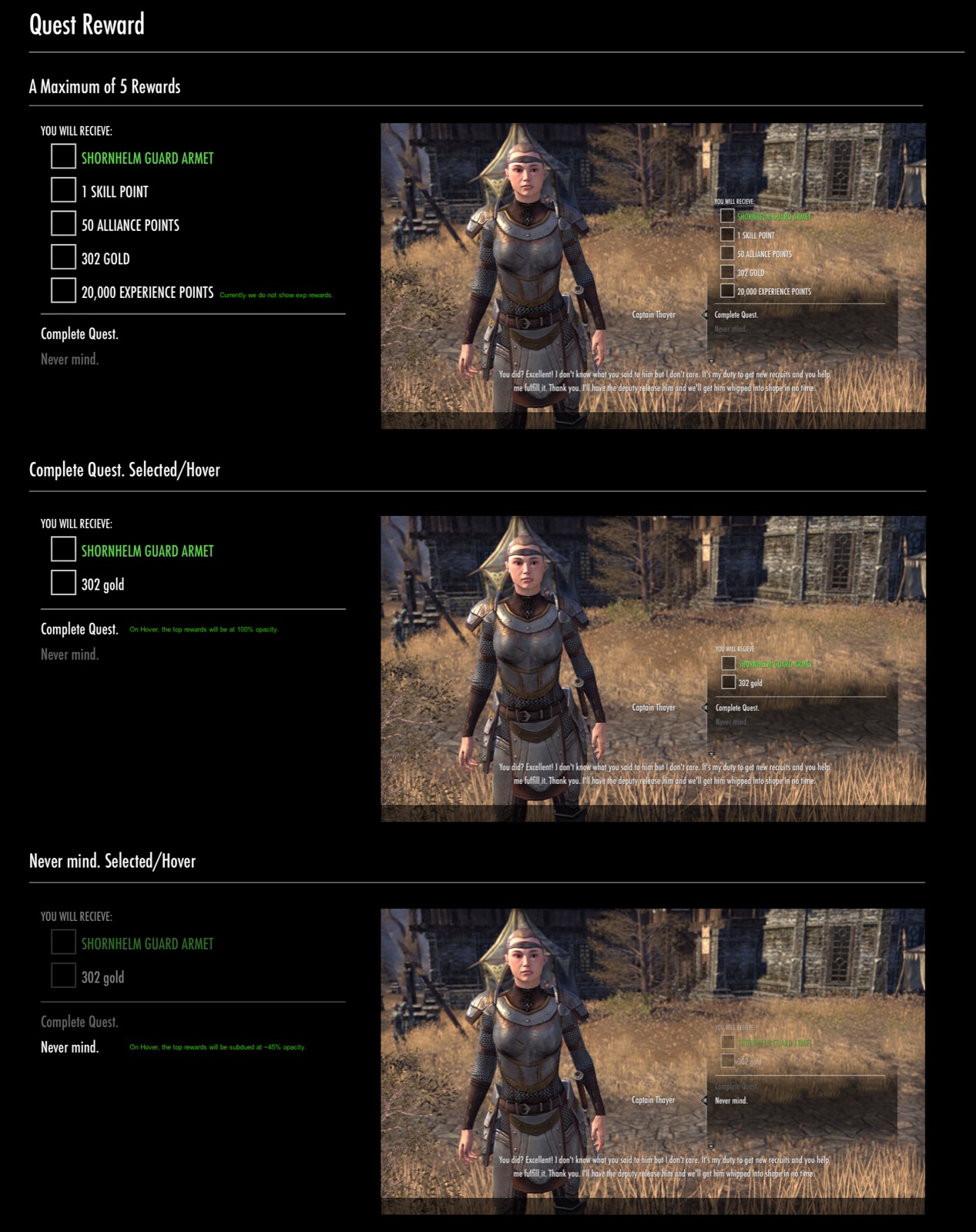
Said why, not just no A locked option doesn’t grey out silently. It carries the reason inline: the perk you lack, the gold you’re short, the requirement not met.
-
C
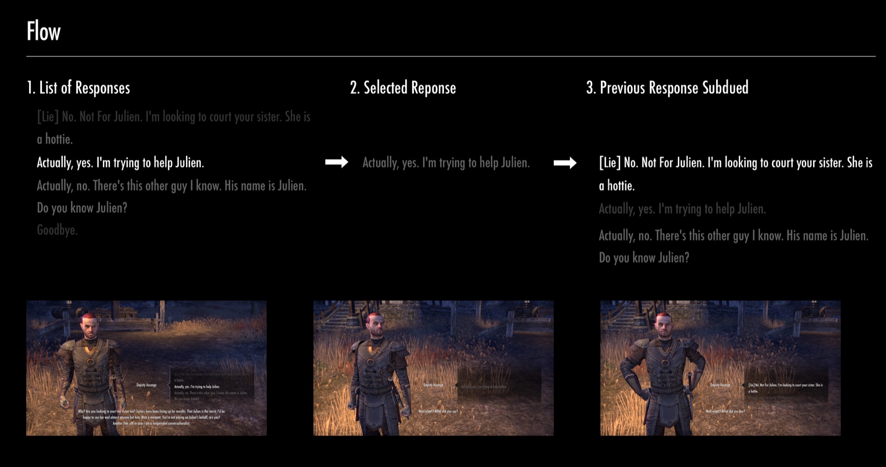
Kept the conversation’s memory visible The previous response stays on screen, subdued, so a player can see the shape of the exchange they’re in rather than one line at a time.